top of page

PEDAL
UX PROTOTYPE
CASE STUDY
Overview
This project was a part of Google's UX Design Certificate program.
OBJECTIVE
I was prompted to create a prototype of an inventory app for a made up bike shop in Colorado. The app needed to follow the specific UX design process outlined by Google.
APPROACH & RESPONSIBILITIES
Each part of the design process was done by me. Digital design was done in Figma!
-
Research
-
Sketching
-
Wireframing
-
Prototyping
-
Usability test facilitation and moderation
-
High-Fidelity design
Process
The process for this project includes the following:
UNDERSTAND
IDEATE
DECIDE
PROTOTYPE
TEST
Interviews
Personas and journeys
Competitive audit
Crazy 8s
Storyboards
Goal Statement
Feature List
Paper Wireframes
LoFi Prototypes
HiFi Prototypes
Usability Testing
Understand
Interviews
Interview 1
Interview 2
Interview 3
Interview 4
The main takeaways from these interviews were:
One person tried to use an app to order bike parts, but gave up because the ability to add a gift card was not easy to find.
One person really values the community that comes with biking.
One person tried to find a part by going into a store but could not find the correct gear. The user ended up buying through amazon which is something she doesn't like to do.
One person really wants a bike shop that she can connect with so she can keep coming back.
Most people know generally what they want, but don't know which brand to go with.
Personas and User Journies
To design the app in a user centered way, I created 3 personas that are based off of the interviews I conducted. Each persona has unique goals and unique frustrations. This helps anchor my focus on specific needs that will also benefit the broader user base.
The personas Ron and Nina both have a permanent or situational disability that creates an accessibility challenge. Designing in an accessible and equitable way not only allows those with disabilities a better user experience, but it also improves the user experience in general!


.jpg)

.jpg)

Competitive Audit

Ideate
Crazy 8s

This crazy 8s exercise is meant to generate ideas at a rapid rate. The specific idea being explored in the picture above is how to grow community connection and customer loyalty within the app. The possible solutions ranged from tracking biking miles, to discounts, to voting for special events.
Storyboards


Decide
GOal Statement
Our Bike Shop App will let users find and order biking gear from their phones which will affect people who need gear but have little time or motivation by allowing users to find the product they need and either pickup or have it shipped to them.
We will measure effectiveness by reading user reviews and tracking orders placed.
Feature List
-
App wide search
-
Voice to text functionality
-
Obvious language settings
-
Delivery and Pickup options
-
App Profile
-
Product Reviews and Ratings
-
Related Items suggestions
-
In-App Order Tracking
Prototype Phase 1
Paper Wireframe
I made 5 iterations of each top level page for the app, with an additional sixth iteration that refines all of the best ideas from the previous five. This way I can flesh out concepts I want for each page, and then mix and match the best ideas together into the final direction.


1/2
Low Fidelity Prototype
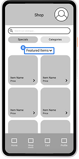
The refined paper wireframes were then made digital in Figma, and given prototype functionality. These prototypes were shared with other designers in the program for general feedback.

Test
I created a Usability Study plan that outlined research goals, questions, key performance indicators (KPIs), and test methodology. I also wrote out a script to keep each usability test consistent. Notes were taken by tracking feedback in an a spreadsheet. Data was then synthesized and grouped into 4 main feedback areas.


1


2


3


4

Prototype Phase 2
High Fidelity Prototype
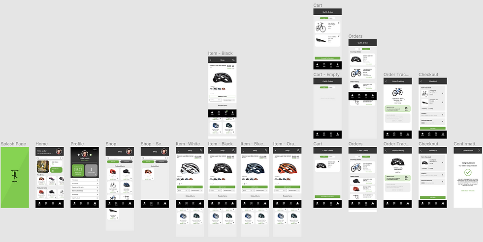
After the wireframes were tested by users and updated, they were brought into the true design phase. Type, color, and graphical elements were chosen and applied. Some visuals were inspired by the simplicity of REI's app. The main screens that allow the user to complete some main user flows were designed, the prototype does not represent the entire app, but could be designed fairly quickly!


Thanks for scrolling!
bottom of page